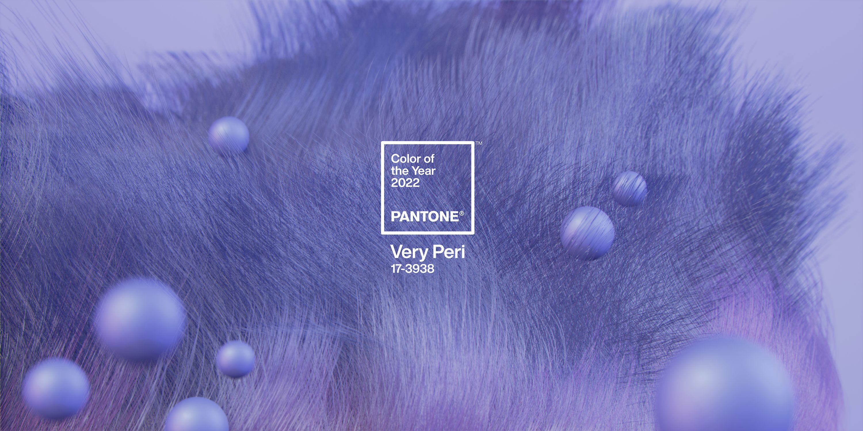
If you’re thinking about painting the interior of your luxury home, then you might want to consider using Pantone colour of the year: Very Peri.
Pantone has announced that their 2022 colour of the year is Very Peri, it is described as a “dynamic periwinkle blue hue with a vivifying violet-red undertone”, the institute said. This is a great colour to use if you want to inject some life into your home and give it a luxurious feel. It’s perfect for living rooms, bedrooms and bathrooms.
In this post, we will share some tips on how to use Very Peri paint colour in your home and achieve a luxurious look.
When using Very Peri in your luxury home, it’s important to consider the other colours that are already present in the space. This blue is quite vibrant and can be overwhelming if used in a room with lots of other bright colours. In this case, it might be better to use it as an accent colour and use it sparingly throughout the space.
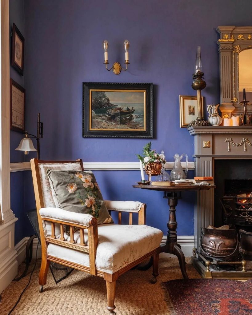
1. As an accent wall colour
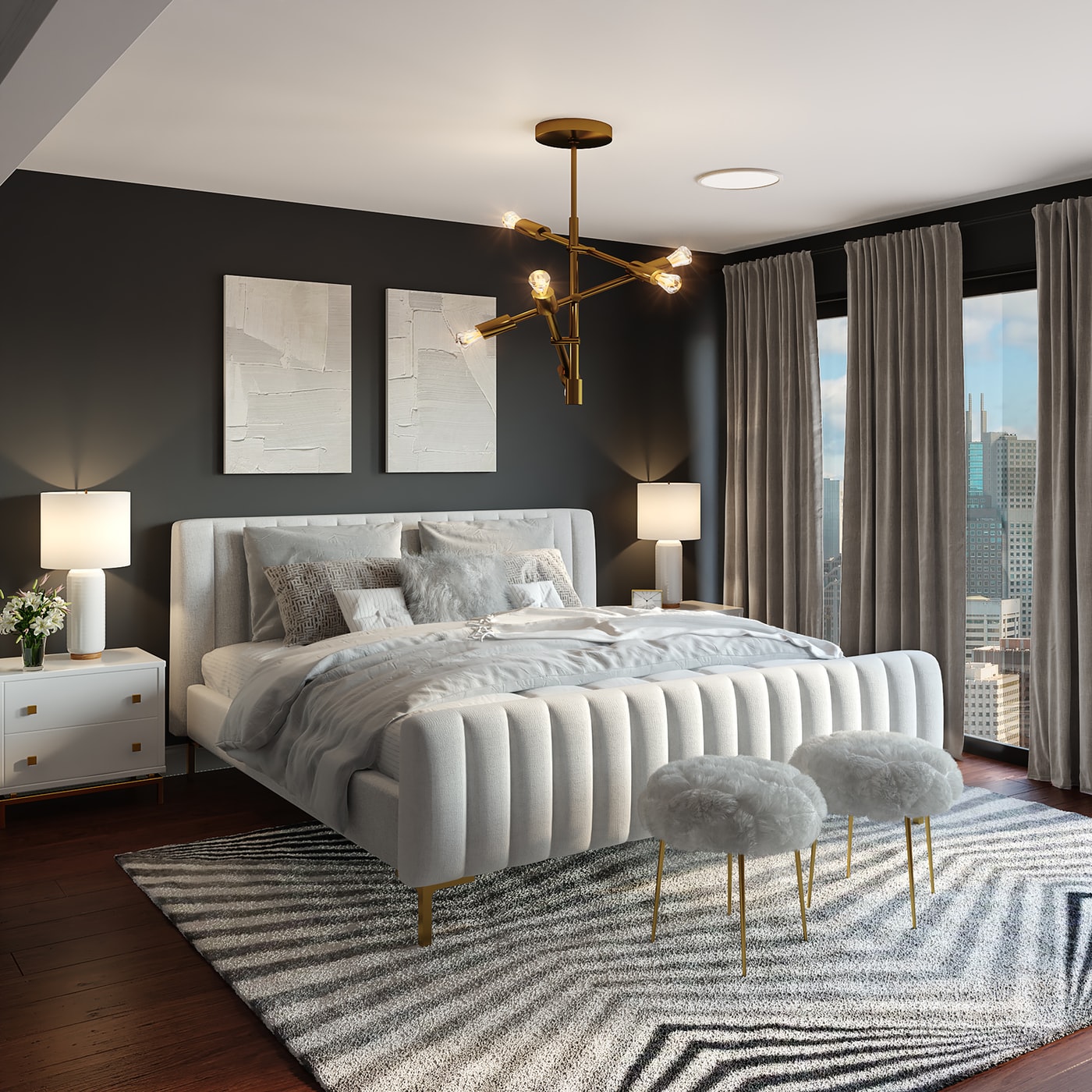
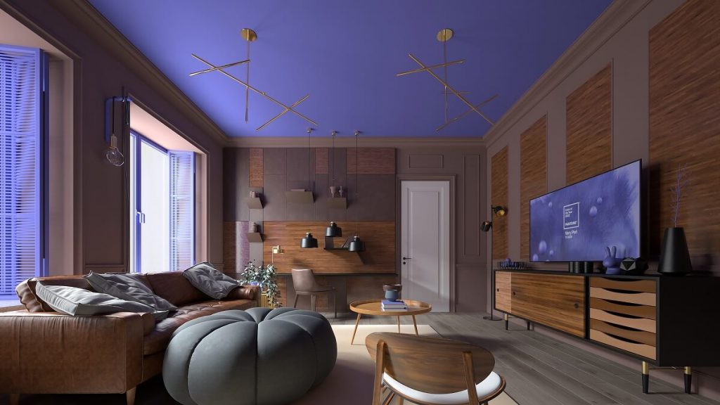
If you’re looking for a way to bring Very Peri into your luxury home, try painting one wall with this luxurious blue. You can choose any room that offers enough contrast such as an office or study, living area or bedroom. For best results, paint ceilings in lighter shades of periwinkle blue to create a sense of expansiveness.
When using Very Peri as an accent wall colour, make sure to select the right paint finish. We recommend using a semigloss or high-gloss paint finish so that the blue pops. You can also use metallic finishes such as gold, silver or bronze to create a glamorous look.
2. As an accent colour in furniture
Another way to use Very Peri in your home is by painting the inside of furniture pieces such as cabinets, bookcases or even chairs. This will add a pop of colour and personality to any room. For a luxurious look, combine Very Peri with dark wood finishes such as mahogany or walnut. You can also use Very peri on light furniture pieces for a more modern look.
You can paint the base of furniture in darker shades for contrast or create an ombre effect by gradually changing from one shade to another as it gets closer to the floor. This type of application is best suited for larger items such as dressers, bookcases and sideboards.
3. Combine it with other colours
Another way to use Very Peri in your home is by combining it with other luxury shades. A great way to use this blue is by pairing it with white walls and furniture pieces. This will give your home a fresh, airy feel. You can also do this on the walls or furniture pieces, depending on whether you want a strong contrast or a subtle ombre effect. For instance, if you have dark wood floors and cabinets in another colour such as browns and greys, you can use Very Peri as an accent colour to brighten up the space.
4. Use it in the bathroom
If you’re looking for a way to add luxury to your bathroom, consider using Very Peri as your main colour. This blue is perfect for bathrooms as it can give them a spa-like feel. You can use it on the walls, floor or even the ceiling. When using this shade in the bathroom, we recommend using metallic finishes such as gold or silver to create a luxurious look.
You can also use Very Peri with other shades of blue for an ombre effect on the walls, floor tiles and even accessories like bath mats, shower curtains or towels. It’s important to consider whether you want more contrast in your bathroom by combining this periwinkle blue with white or you prefer a subtler ombre effect.
5. As part of your decor and accessories
Finally, you can use Very Peri in your home by adding accessories such as pillows, throws, rugs or wallpaper. This is a great way to add a pop of colour and personality to any room. You can also change the look of a room quickly and easily by using different accessories in different seasons.
When selecting accessories in this shade, we recommend using them in small doses. For example, you can use a throw or rug on your sofa and add pillows to the bed with different shades of periwinkle blue for contrast. You can also paint lampshades or switch out doorknobs if they aren’t already painted the shade that you want.
As a bonus, using accessories in this shade will help to keep your home looking fresh and new for longer. So if you’re ever feeling bored with the look of a room, simply switch out some of the accessories to get a whole new look.
We hope these tips have given you some ideas on how to use Pantone’s Colour of the Year: Very Peri in your home. This blue is perfect for adding a touch of luxury and personality to any room—so why not give it a try? Keep exploring ways to bring colour and character into your interiors!